Graphics hubio health
The graphs you will find in your profile are associated with your health information. Each graph is intended to visually explain the status of a particular variable. Click on the graph you would like to learn more about:
Life Expectancy
This is a measure of the AVERAGE age to which people usually live in a population with certain demographic characteristics. In this case it refers to the average age to which people of your age and sex tend to live in your country and state of origin. Although it is NOT a measure of how long you will live (it is not a measure of personal lifespan), you can expect to have a lifespan similar to your Life Expectancy because it is related to the Population of which you are a part.
Healthy Life Expectancy
This is a measure of the NUMBER OF YEARS ON AVERAGE that a reference population usually lives in complete health. Being referenced to people of your age, sex and place of birth, although it is not a measure of personal over-life, but of over-life of a population similar to your population of origin, it could give you an idea of how many years you could expect to live in good health. Each deterioration you suffer in your health has a time duration and a level of deterioration. The difference between this indicator and your Life Expectancy corresponds to the number of years (adding up each of the events that could threaten your health, along with the severity of each of the conditions) that you could expect to be in less than optimal health .Remember that these Indicators are ways of measuring the health of populations. As you are part of a population, which may be more like you as it shares more characteristics with you, they can serve as a guide to the intensity of the risks to which you are subject.
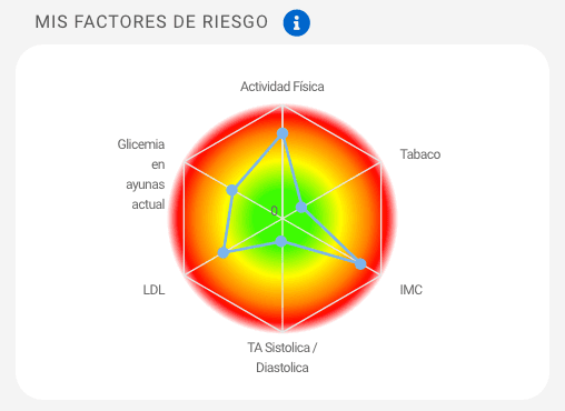
My Risk Factors
As you can see in your Risk Factors chart, each of the risk factors you have captured has a rating, this rating is related to a color, green (0 or absence of risk) in the central part, to red (5 or maximum presence of risk) towards the outer part of the chart.
Through this chart you can guide you to identify which risk factor is the one that impacts your health the most. With this chart you can make decisions about which factor you want to start working on and when.
Learn more about the risk factors in your hubio health profile here.
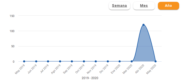
Line Graphics
For each Risk Factor, you will be able to observe two graphs: an Odometer and a Line Graph. The Line Graph allows you to observe the evolution of the selected risk factor over time. You can click on the Year, Month and Week, Month and Week buttons to visualize the information in different time periods.
Click on Year: display the information of a year divided by month.
Click on Month: display the information of a month divided by weeks.
Click on Week: display the information of a week divided by day.
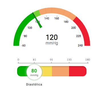
Odometer
This graph will allow you to identify the rank you are in for each risk factor according to the data entered. Use the same rating assigned for the graph in your initial My Risk Factors dashboard, this rating is related to a color that corresponds to a range in the Odometer, starting with the range in Green (absence of risk) to the range in red (maximum presence of risk).
Learn more about the risk factors in your hubio health profile here.


